Data viewer
The data viewer in Sympathy for Data allows fast and easy inspection of the port data. It can be opened by double-clicking an output port of any executed node.
The appearance of the data viewer varies depending on the port data type.
Container types: list, tuple, dict, etc., have their own viewers that in turn include viewers for the data type they contain. For example, the viewer for a list of tables ([table]) will show a list viewer containing a table viewer.
It is also possible to launch the data viewer from the command line, to open saved .sydata-files, as described in the launch options.
List viewer
Shows a list of available items to the left and a viewer for the contained data type to the right. Selecting different items of the list will bring the data for the selected item into the right viewer.
Table viewer
The table viewer shows a data table to the left and can optionally show a plot to the right. The data toolbar is located above the data table.
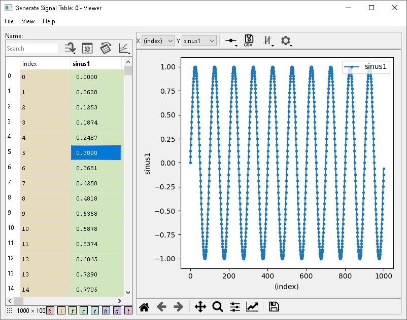
The table viewer showing a line plot.
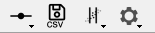
The data toolbar of the table viewer has the following functions:
The search field allows a quick search of the column names. For further explanation of the functionality, see below.
The jump button, with some lines and an arrow, is for jumping to a specific row. When data is transposed it will jump (scroll the view) horizontally instead of vertically.
The document button toggles between a view of the table’s data and its attributes. In case there are no attributes, this view will be empty.
The transpose button flips the table so that rows become columns and columns become rows. This can be useful, for example, when there are many columns with long names, but fewer rows.
The graph button shows a menu with 3 different plot options: No plot (default), Line plot and Histogram plot. When Line or Histogram plot is selected a plot will be shown.
Data toolbar of the table viewer.
The data table also has a right-click context menu allowing quick selection of columns to plot as either x (Plot as x) or y (Plot as y) signal. Multiple columns can be plotted against the same x signal. Show histogram will show a histogram of the selected column.
The number of rows and columns (row x column) is shown in a little box on the bottom left of the data table.
Note
Due to limitations of the underlying GUI framework, tables with more then 71’582’788 rows will be truncated in the table component of the data viewer. This will be shown with a line in red: Data truncated.
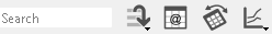
Searchbar
The searchbar allows you to filter what columns are shown in the data table. The default filtering is performed on the column names only by means of a fuzzy filter, as shown in the example where the column names are TEST, CAR, PLANE and TURBINE.
A |
CAR, PLANE |
E |
TEST, PLANE, TURBINE |
NE |
PLANE, TURBINE |
If you enter a * or ? wildcards, the filtering changes to a glob
filter, where * matches any number of any character and ? matches
exactly one. Please be aware that the glob filter shows only exact
matches for the search pattern. Some examples.
T* |
TEST, TURBINE |
?A? |
CAR |
You can also use different search patterns separated by a ,. Each pattern
can be either fuzzy or glob. Any column matching any of the patterns is
shown. For example:
T*,CA |
TEST, TURBINE, CAR |
By default only the column names are used when searching, but there are some
search pattern prefixes that you can use to change this behavior. These
prefixes are :c, :a, and :*. Here are some examples:
:c T* |
will search in the column names only |
:a T* |
will search in the attributes only |
:* T* |
will search in column names and attributes with the same pattern |
The prefixes can also be combined with the multi-pattern search with ,
separator, as well as multiple prefixes are allowed to be chained to refine
the search by column names and attributes.
:c T*,CA |
searches for column names with patterns T* ( glob filter) and CA |
:c T* :a m,T |
searches for column names with pattern T* ( glob filter) and within this set for attributes with m and T ( fuzzy filter) |
Plot
The plot can shown either a Line or a Histogram. These are different and have different options in the upper toolbar, etc., as seen in the different subsections below.
Warning
Plotting large amounts of rows and several columns can result in slow plotting and the GUI might become unresponsive.
The toolbar below the plot area allows for easy zooming, panning, and moving through the zoom/pan state history. It also has the option to save the current figure (Save icon) and alter the appearance of the lines or scatters of the plotted data (checkbox icon).
Line plot
Shows a scatter plot of the selected x and y columns.
- X
Specifies the column used for the x axis.
- Y
Specifies the columns plotted as y-values. Multi-selection is allowed. Un/checking a column will remove or add it to the plot.
- Line and marker button
Choose between Marker, Line and Line and marker for the plotted columns.
- CSV button
Save the data to a CSV file, if cursors are used: save the data between the cursors, otherwise: save all data.
- Cursor button
Show a menu with cursor options.
- Plot preferences
Shows a menu with options for:
- Auto downsampling
When checked, automatically determine the downsampling step from the data so that the number of data points plotted does not exceed the limit of 10000 points.
- Downsampling
The downsampling step size (n) is used to limit the number of values plotted by taking the first and then every nth value.
1: every value (no downsampling),
2: every other value,
…
n: every nth value.
Upper plot toolbar of the table viewer.
Histogram
Specifies the column used to plot the histogram. Some statistics for the column’s data is shown in an inset in the histogram.
- Plot preferences
Shows a menu with options for:
- Auto downsampling
Same as for line plot, see above.
- Downsampling
Same as for line plot, see above.
- Auto bins
Automatically determine the number of bins from the data (0 - 10).
- Number of bins
The number of bins used for the histogram.
- Auto range
Automatically determine the histogram range (range min and range max) from the data.
- Range min
Selecting the minimum value for the histogram range.
- Range max
Selecting the maximum value for the histogram range.
ADAF viewer
The ADAF viewer shows data, using the table viewer, in three different tabs: Meta, Result and Timeseries. These correspond to the different sections of the ADAF file.
The Meta and Result tabs just shows table viewers (with plotting disabled) but the Timeseries tab offers some new features, found in the first row: here you can select which System and Raster to view, Search for signals and use Hold to plot data from different rasters together.
Click the search button (magnifying glass icon) to start search, this shows an index of the Timeseries, which can be filtered by Signal name. When you found the row you were looking for, double-click on a row to exit search and view the corresponding Raster.
When Hold is active, columns plotted as Y signals will be identified by their full path in the ADAF file (i.e. system-name/raster-name/signal-name). When switching to another raster, the viewer will remember (hold) the previous signal selection. Changing the X axis will only affect the signals in the current raster and for signals outside of the current raster the viewer instead remembers the X axes you previously selected. Export of CSV using the viewer is not supported in Hold mode.