The graphical user interface
The graphical user interface or GUI for Sympathy for Data is the main interface, where you can create, edit, and run workflows.
In the main interface of Sympathy for Data a number of smaller windows can be displayed, where each of these windows have their own functionality. When Sympathy for Data is started two of these windows will be displayed, the workspace window and the node library window. These two windows are vital for the construction of the workflows. The other windows are more informative.
All windows, except the workspace window, can be turned on/off from the View menu.
A screenshot of the start view in Sympathy for Data is shown below. In this screenshot the workspace window and the node library window are located to the right and the left, respectively.
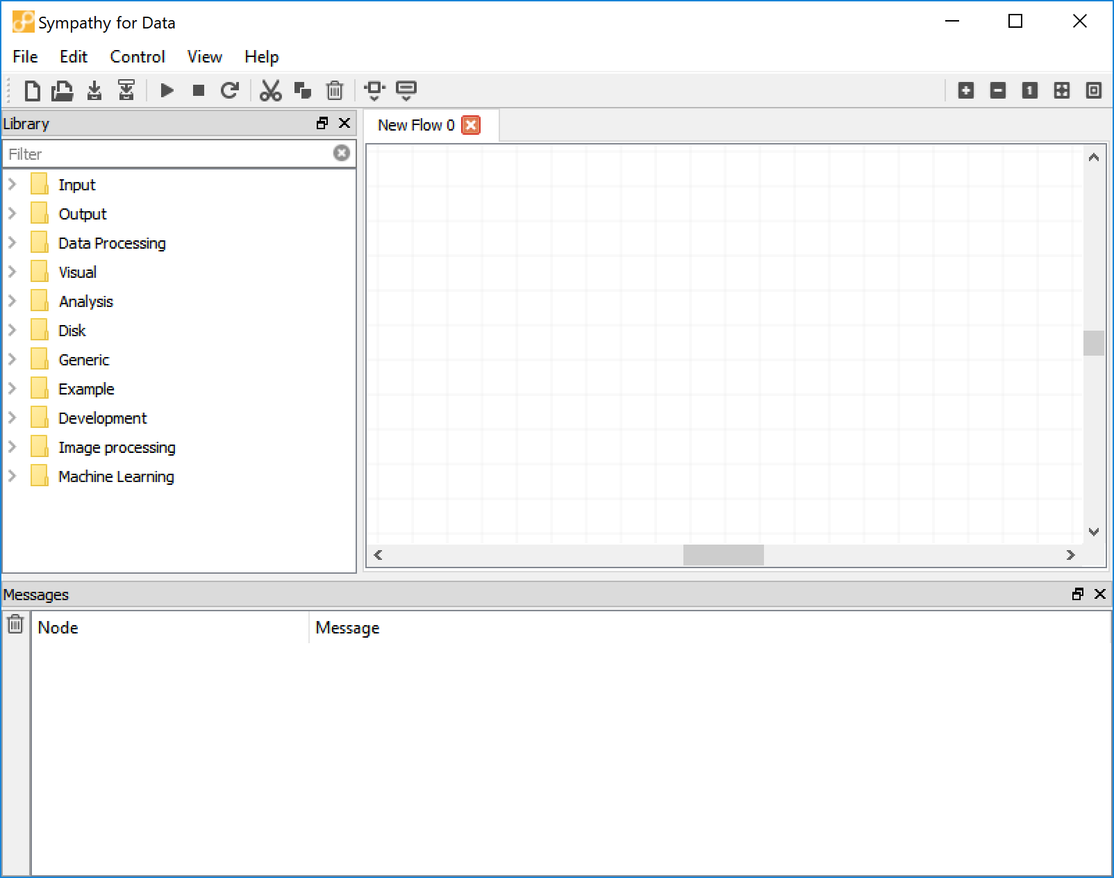
Screenshot of the startup view of the main window in Sympathy for Data.
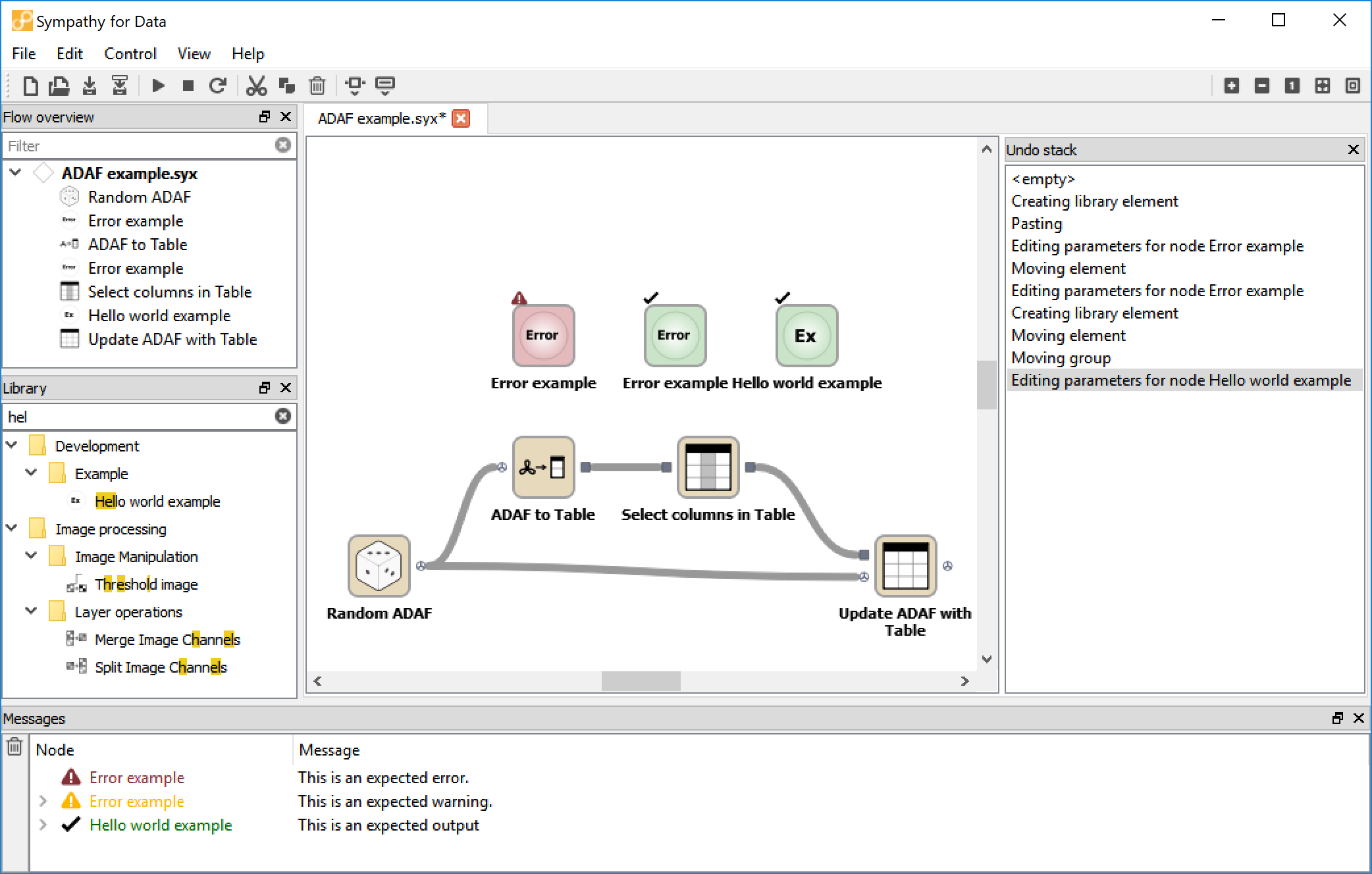
Screenshot of Sympathy for Data with all windows in use.
The node library window
It is through the node library window that you get access to the nodes, the building blocks of the data analysis workflows. The nodes are stored in a tree structure and are categorized by their functionalities. The nodes are added to the flow with drag and drop.
There are two ways of getting more information about a node in the library window. Brief information, consisting of a short description and a declaration of the incoming and outgoing data types, is displayed in a tooltip when resting the cursor over a node in the library view. The more detailed documentation is accessed by right clicking on the node and selecting “Help”. A web browser will open to display the node documentation. Documentation for all nodes in the library can also be found here.
It is possible to add new node libraries to the node library window. These are generally referred to as third-party libraries. When you have downloaded a third-party library you can add it to Sympathy in the preferences dialog. Go to the page Node libraries and click add. Then add the folder containing the Library folder.
Messages window
The Messages window is where all output from nodes ends up; be it errors, warnings, or simple notices.
When a node has something to say it will add a single row to the Messages window. This summary line consists of the node’s label in the node column and a summary of the output in the details column. If you click on the arrowhead to the left of the node label the row will expand and show more details.
You can right-click anywhere in the Node column and choose Clear to remove any old content from this view and more easily notice new output.
There are four different severities in the output, ranging from least to most severe:
- Notice
- Informative non-crucial output that does not affect the node’s ability to complete its task. For messages at this level the node label is green and accompanied by a tick mark.
- Warnings
- A node will give you a warning when it suspects that something might be wrong, but it is still able to complete its task. You should usually take a look at any warnings and judge for yourself if some action needs to be taken. For messages at this level the node label is yellow and accompanied by a yellow warning sign.
- Error
- An unrecoverable error occurred during node execution. These errors are usually due to problems with either the node’s configuration or the data that it received. The details can sometimes give more information about how to fix the problem. For error messages the node label is red and accompanied by a red warning sign.
- Exception
Like the Error level this also represents some unrecoverable error during node execution. The difference is that an exception is some kind of error that the node developer has not anticipated. Sometimes these errors can be fixed simply by fixing some problem with the configuration or input data, but it can also be that there is some problem that needs to be fixed in the source code for the node.
A good quality node should in principle never give exceptions. You should consider reporting any exceptions you see to the node developer. The details for an exception will provide a stack trace which gives information to the node developer about where in the code the error arose. Messages at this level look just like error messages except for the traceback provided in the details.
Flow overview
The flow overview can be accessed via the view menu. It shows all subflows and nodes in the current workflow. Click on a node or subflow to jump to that node or subflow.
When typing something into the filter textbox only subflows and nodes whose labels match the filter are shown. This can help you quickly find nodes or subflows even in very large workflows.
Undo stack
The undo stack shows all historical operations preformed in the active workflow. Each operation (create node, move node, delete node, connect nodes etc.) is represented by a row in the undo stack with new operations being added at the bottom. If you select a specific row Sympathy will undo all operations below the selected row, effectively jumping to a point in time just after the selected operation was performed.
Data viewer
The data viewer shipped with Sympathy for Data allows easy and fast inspection of the data stored in the different data types. It can be either called directly from within Sympathy for Data by double clicking an output port of any executed node or by launching it from the command line as described in the launch options.
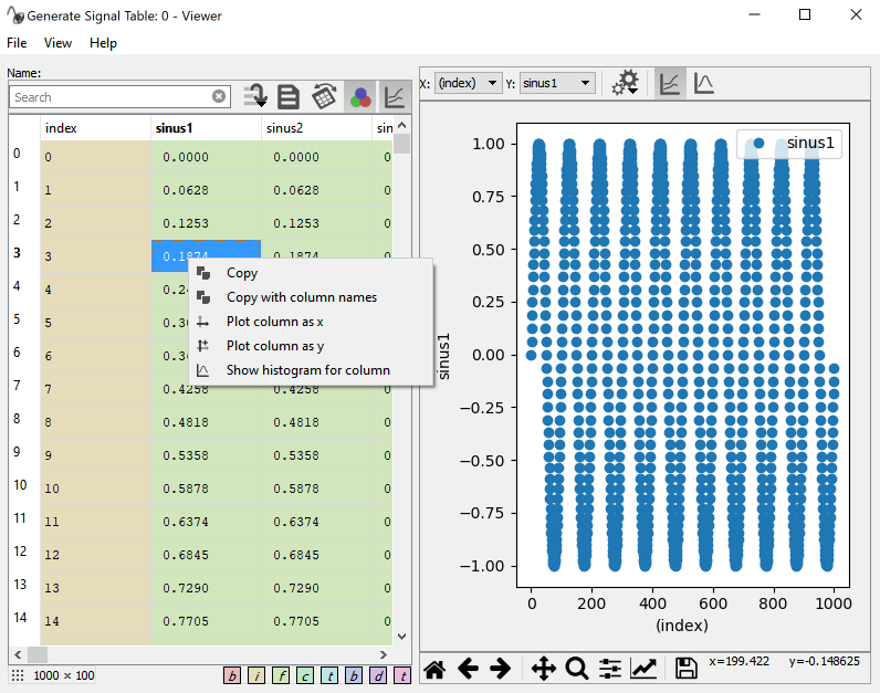
Screenshot of the Data viewer with activated plot.
Preview Table
The appearance of the Data viewer varies depending on the loaded data type. In the tables view a list of available tables is shown on the very left. Selecting different items of the list will bring the selected table data into the table preview. The preview table has a toolbar with some useful functions:
- The search box allows a quick search of the column names. For further explanation of the functionality, see below.
- The button with some lines and an arrow is for jumping to a specific row. When data is transposed this will scroll the view horizontally instead of vertically.
- The document icon toggles between a view of the table’s data and its attributes. In case there are no attributes, this view will be empty.
- The transpose button flips the table so that rows become columns and columns become rows. This can be useful, for example, when there are many columns with long names, but fewer rows.
- The three color circle icon toggles the data type background coloring in the data table view on/off.
- The graph icon toggles the plot view on/off.
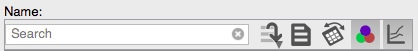
Screenshot of the preview table toolbar showing the searchbar and toggle buttons.
The preview table also has a right-click context menu allowing quick selection of columns to plot as either x (Plot as x) or y (Plot as y) signal. Multiple columns can be plotted against the same x signal. Show histogram will show a histogram together with some basic statistics of the selected column.
The number of rows and columns (row x column) is shown in a little box on the bottom left of the preview table.
Note
Due to limitations of the underlying GUI framework, tables with more then 71‘582‘788 rows will be truncated. This will be shown with a line in red: Data truncated. This does not influence the plotting capability of large data.
Searchbar
The searchbar allows you to filter what columns are shown in the preview table. The default filtering is performed on the column names only by means of a fuzzy filter, as shown in the example where the column names are TEST, CAR, PLANE and TURBINE.
| A | CAR, PLANE |
| E | TEST, PLANE, TURBINE |
| NE | PLANE, TURBINE |
If you enter a * or ? wildcards, the filtering changes to a glob
filter, where * matches any number of any character and ? matches
exactly one. Please be aware that the glob filter shows only exact
matches for the search pattern. Some examples.
| T* | TEST, TURBINE |
| \*NE | PLANE, TURBINE |
| ?A? | CAR |
| \*A* | CAR, PLANE |
You can also use different search patterns separated by a ,. Each pattern
can be either fuzzy or glob. Any column matching any of the patterns is
shown. For example:
| T*,CA | TEST, TURBINE, CAR |
By default only the column names are used when searching, but there are some
search pattern prefixes that you can use to change this behavior. These
prefixes are :c, :a, and :*. Here are some examples:
| :c T* | will search in the column names only |
| :a T* | will search in the attributes only |
| :* T* | will search in column names and attributes with the same pattern |
The prefixes can also be combined with the multi-pattern search with ,
separator, as well as multiple prefixes are allowed to be chained to refine
the search by column names and attributes.
| :c T*,CA | |
| :c T* :a m,T | searches for column names with pattern T* ( glob filter) and within this set for attributes with m and T ( fuzzy filter) |
Plot
The plot has two toolbars, one above and one below the plot area. The one above allows changing of the following parameters:
- X
- Specifies the column used for the x axis.
- Y
- Specifies the columns plotted as y-values. Multi-selection is allowed. Un/checking a column will remove or add it to the plot.
- Histogram
- Specifies the column used to plot the histogram. Some statistics regarding the column’s data is shown in an inset in the histogram.
- Plot settings
Popup menu with configurable settings for.
- Resample
- This integer value specifies the step size used for resampling in case the upper limit of 10000 points is exceeded. This value will be automatically updated on data refresh.
- Plot large data
- In case of large data columns, >10 million rows, plotting will be disabled by default and needs to be activated by this checkbox. This checkbox is hidden for datasets not exceeding this limit.
- Binning
- Selecting the number of bins used for the histogram. Hidden in Line plot mode.
- Line graph
- Sets the plot to a scatter plot of the selected x and y columns.
- Histogram graph
- Set the plot to a histogram using the last selected/active column in the Y selector. Selecting the histogram plot will hide the X and Y selection boxes and shows the histogram selection box.
The toolbar below the plot area allows for easy zooming, panning, and moving through the zoom/pan state history. It also has the option to save the current figure (Save icon) and alter the appearance of the lines or scatters of the plotted data (checkbox icon).
Warning
Plotting large amounts of rows and several columns can result in slow plotting and the GUI might become unresponsive.