Data viewer
The data viewer shipped with Sympathy for Data allows easy and fast inspection of the data stored in the different data types. It can be either called directly from within Sympathy for Data by double clicking an output port of any executed node or by launching it from the command line as described in the launch options.
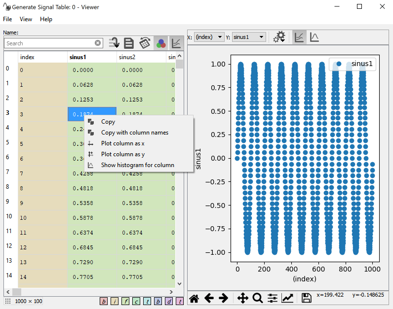
Screenshot of the Data viewer with activated plot.
Preview Table
The appearance of the Data viewer varies depending on the loaded data type. In the tables view a list of available tables is shown on the very left. Selecting different items of the list will bring the selected table data into the table preview. The preview table has a toolbar with some useful functions:
The search box allows a quick search of the column names. For further explanation of the functionality, see below.
The button with some lines and an arrow is for jumping to a specific row. When data is transposed this will scroll the view horizontally instead of vertically.
The document icon toggles between a view of the table’s data and its attributes. In case there are no attributes, this view will be empty.
The transpose button flips the table so that rows become columns and columns become rows. This can be useful, for example, when there are many columns with long names, but fewer rows.
The three color circle icon toggles the data type background coloring in the data table view on/off.
The graph icon toggles the plot view on/off.
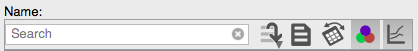
Screenshot of the preview table toolbar showing the searchbar and toggle buttons.
The preview table also has a right-click context menu allowing quick selection of columns to plot as either x (Plot as x) or y (Plot as y) signal. Multiple columns can be plotted against the same x signal. Show histogram will show a histogram together with some basic statistics of the selected column.
The number of rows and columns (row x column) is shown in a little box on the bottom left of the preview table.
Note
Due to limitations of the underlying GUI framework, tables with more then 71’582’788 rows will be truncated. This will be shown with a line in red: Data truncated. This does not influence the plotting capability of large data.
Searchbar
The searchbar allows you to filter what columns are shown in the preview table. The default filtering is performed on the column names only by means of a fuzzy filter, as shown in the example where the column names are TEST, CAR, PLANE and TURBINE.
A |
CAR, PLANE |
E |
TEST, PLANE, TURBINE |
NE |
PLANE, TURBINE |
If you enter a * or ? wildcards, the filtering changes to a glob
filter, where * matches any number of any character and ? matches
exactly one. Please be aware that the glob filter shows only exact
matches for the search pattern. Some examples.
T* |
TEST, TURBINE |
?A? |
CAR |
You can also use different search patterns separated by a ,. Each pattern
can be either fuzzy or glob. Any column matching any of the patterns is
shown. For example:
T*,CA |
TEST, TURBINE, CAR |
By default only the column names are used when searching, but there are some
search pattern prefixes that you can use to change this behavior. These
prefixes are :c, :a, and :*. Here are some examples:
:c T* |
will search in the column names only |
:a T* |
will search in the attributes only |
:* T* |
will search in column names and attributes with the same pattern |
The prefixes can also be combined with the multi-pattern search with ,
separator, as well as multiple prefixes are allowed to be chained to refine
the search by column names and attributes.
:c T*,CA |
|
:c T* :a m,T |
searches for column names with pattern T* ( glob filter) and within this set for attributes with m and T ( fuzzy filter) |
Plot
The plot has two toolbars, one above and one below the plot area. The one above allows changing of the following parameters:
- X
Specifies the column used for the x axis.
- Y
Specifies the columns plotted as y-values. Multi-selection is allowed. Un/checking a column will remove or add it to the plot.
- Histogram
Specifies the column used to plot the histogram. Some statistics regarding the column’s data is shown in an inset in the histogram.
- Plot settings
Popup menu with configurable settings for.
- Resample
This integer value specifies the step size used for resampling in case the upper limit of 10000 points is exceeded. This value will be automatically updated on data refresh.
- Plot large data
In case of large data columns, >10 million rows, plotting will be disabled by default and needs to be activated by this checkbox. This checkbox is hidden for datasets not exceeding this limit.
- Binning
Selecting the number of bins used for the histogram. Hidden in Line plot mode.
- Line graph
Sets the plot to a scatter plot of the selected x and y columns.
- Histogram graph
Set the plot to a histogram using the last selected/active column in the Y selector. Selecting the histogram plot will hide the X and Y selection boxes and shows the histogram selection box.
The toolbar below the plot area allows for easy zooming, panning, and moving through the zoom/pan state history. It also has the option to save the current figure (Save icon) and alter the appearance of the lines or scatters of the plotted data (checkbox icon).
Warning
Plotting large amounts of rows and several columns can result in slow plotting and the GUI might become unresponsive.