Example usage
The workflow
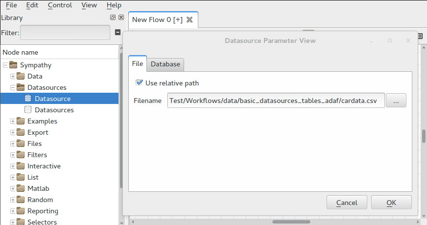
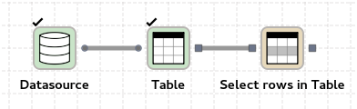
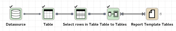
Start by creating a new flow and import the bundled example data called
cardata.csv using Datasource and Table.
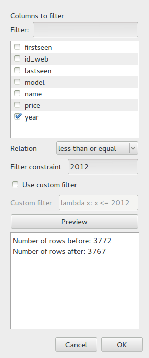
Use Select rows in Table to keep samples below year 2012.
Convert the resulting table into a list of tables using Item to List. Add a Report Template Tables and open its configuration dialog.
Creating a scatter plot
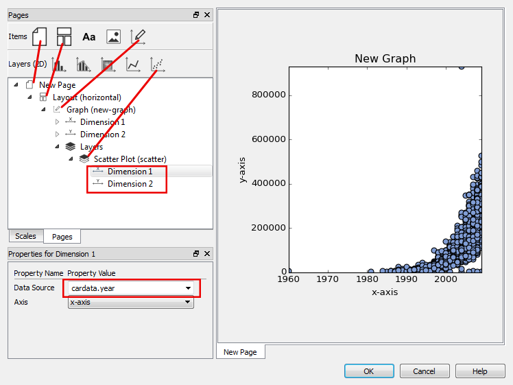
Drag a page icon from the items toolbar into the tree view area. Drag a layout
item and drop it onto the new page followed by a graph item onto the layout
item. An empty graph area should appear in the preview. Now drag a scatter plot
and drop it on the Layers node inside the Graph. Expand the Layers node and the
scatter plot and click on Dimension 1. Set its data source to cardata.year.
For Dimension 2, set the data source to cardata.price. Now a scatter plot
with content should be visible in the preview.
Using scales
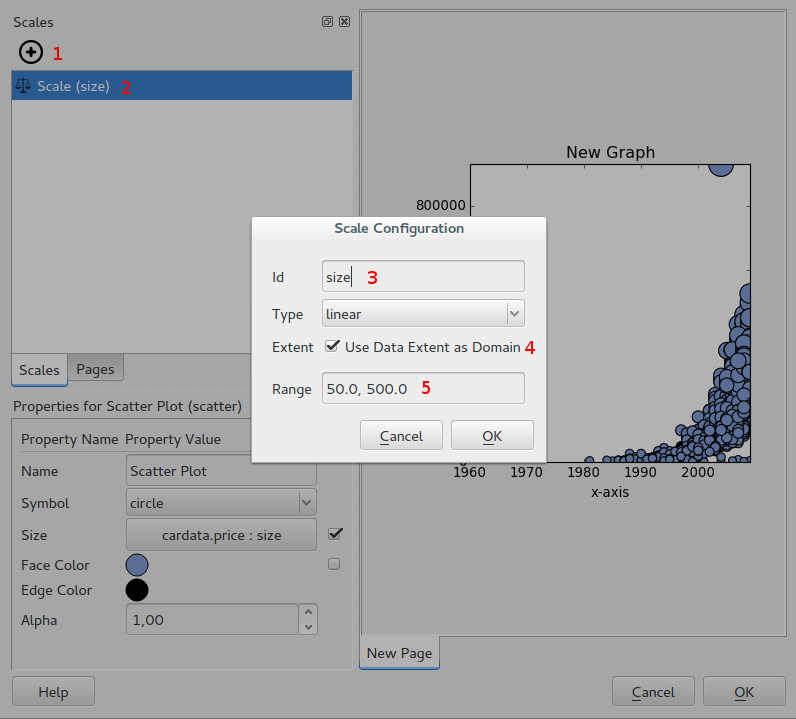
Create a new scale by opening the Scales page on the left side of the screen.
Add a new scale by clicking the plus button at the top. Set its id to size,
set the type to linear and enable Use data extent as domain. Finally, set the
range to 50, 500. This scale will be used to set the size of the circles in
the scatter plot meaning that the sizes will range from 50 to 500.
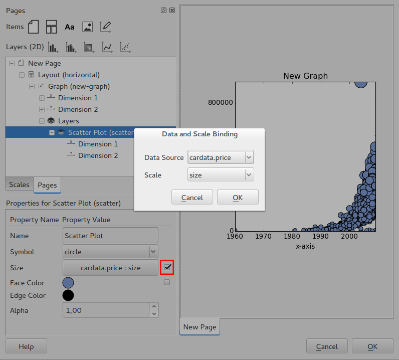
Click on Scatter Plot (scatter) in the tree view. In the properies view, enable
the checkbox to the right of Size and choose cardata.price as data source
and size as scale. The size of the points should now vary by price.
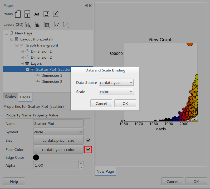
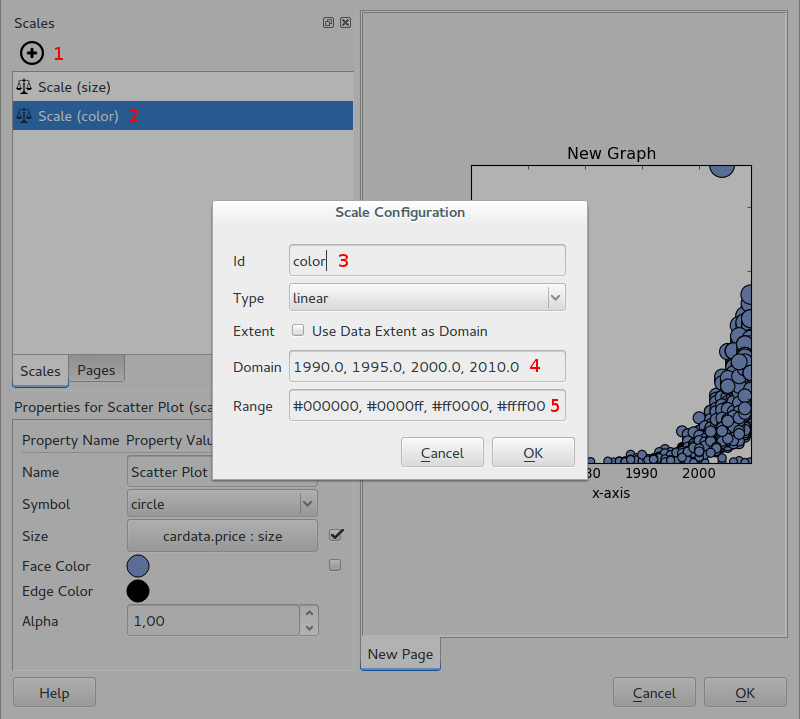
Now let’s color the circles by year. Start by creating a scale with id
color. Use a linear type and set the domain to 1990, 1995, 2000, 2010
and the range to #000000, #0000ff, #ff0000, #ffff00. This means that for
input values of 1990 or less we will get a black color. Between 1990 and 1995
the color is linearly interpolated between black and blue, 1995 to 2000 goes
between blue and red and finally 2000 to 2010 makes a transition between red
and yellow. Interpolation is done in the RGB color space.
Click on Scatter Plot (scatter) in the tree view and enable the checkbox to
the right of Face Color. In the dialog, choose cardata.year as data
source and color as scale. The points are now colored by year.